Hidden Cove
Hidden Cove
Hidden Cove
Hidden Cove
_X2A6962a
Hidden Cove
Hidden Cove
Hidden Cove
Hidden Cove
Hidden Cove
Hidden Cove
Hidden Cove
Hidden Cove
Hidden Cove
Hidden Cove
Hidden Cove
About This Project
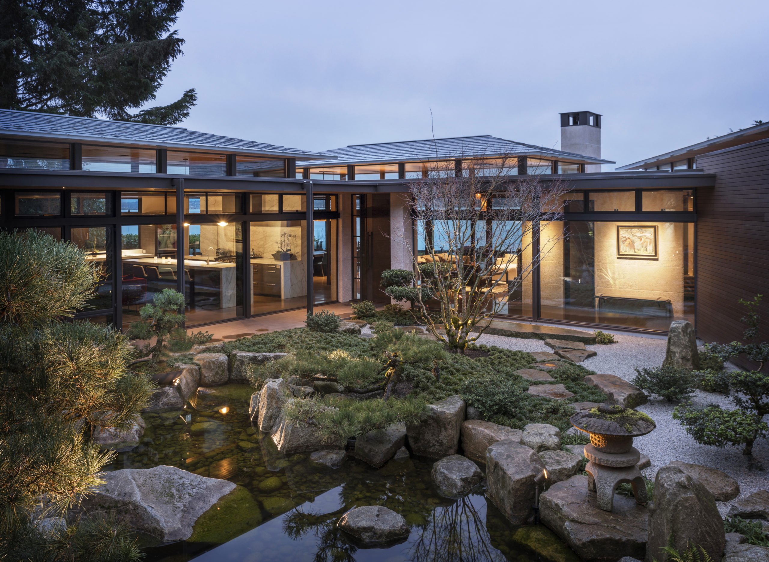
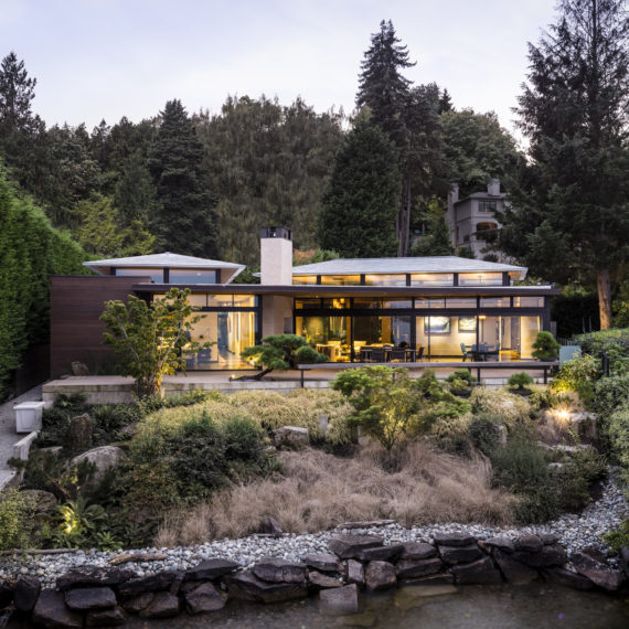
This wooded site is on a small bay on Lake Washington in Washington Park. The parcel enjoys sweeping views of Lake Washington and the Cascade Mountains was well suited for our client’s collection of specimen trees. Our client’s dream was to find a waterfront property, with perfect exposure, that would allow them to build a courtyard garden that could accommodate these woodland treasures. They love the calming effect of water, enjoy rowing along its shores, and viewing the nearby eagles, otters, and blue herons. Our clients have long been drawn to Japanese gardens because of their serenity and beauty. For over twenty years they have amassed an impressive collection which they have lovingly cared for and painstakingly pruned consistent with the ancient traditions of Japanese landscaping. For them, the garden was as important as the home.
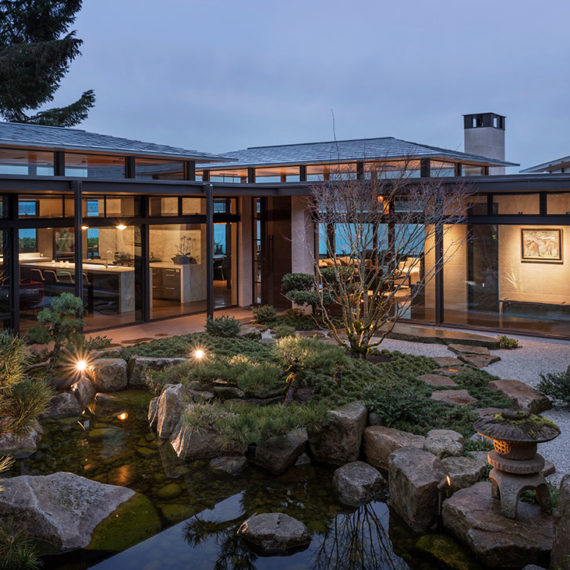
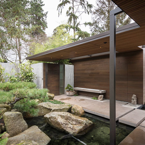
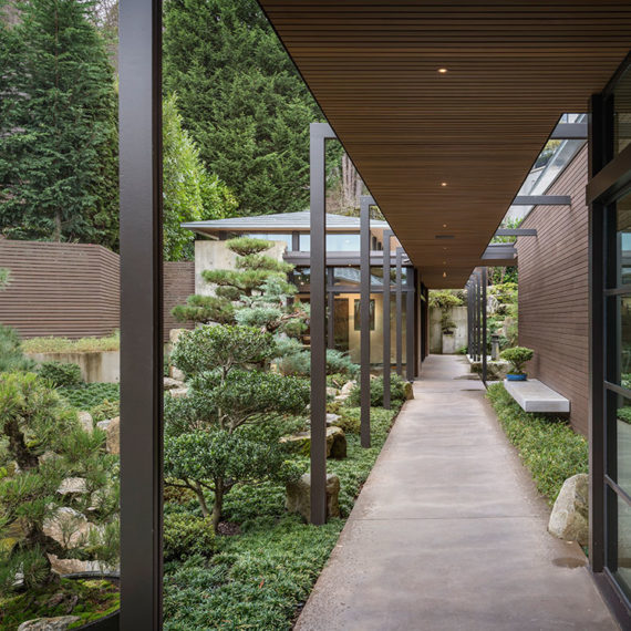
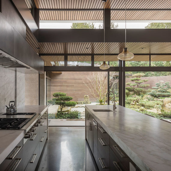
As architects, we wanted to merge garden and shelter. We conceived of a home as collection of one-story pavilions with the garden at its center. We wanted the house to surround the garden to create an experience that is sanctuary-like and has a sense of stillness and calm. The oddly shaped parcel was challenging but allowed us to expand the gardens and resulted in one pavilion being slightly off axis with the others, ultimately creating greater interest. To maximize light the main pavilions run in an east/west orientation. The garden is divided into two principal rooms connected by a water course that falls from the street towards the lake and represents a journey from the mountain to the sea. The pavilions are connected by a covered walkway that runs most of the length of the property knitting the pavilions together. The interplay between garden and structures weaves a complex interplay in a dance that enhances both. The result is a living experience filled with surprise and delight as the garden reveals its many secrets. The question one asks: is the garden the foil for the architecture or is the architecture the foil for the garden?
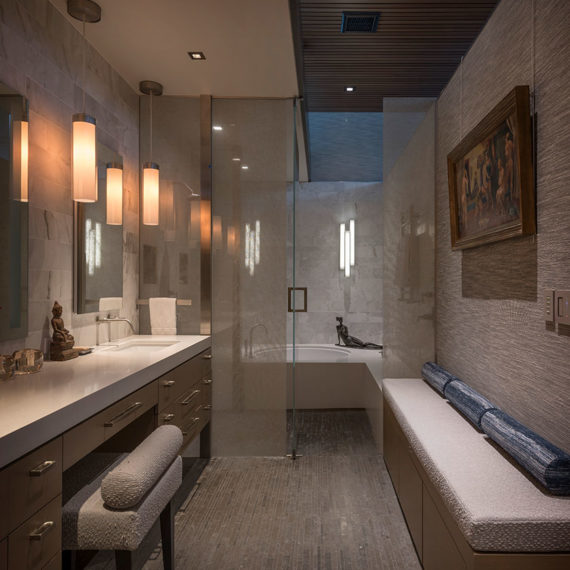
Architecturally, we wanted this home to capture the essence of traditional Japanese buildings without mimicry. We wanted this home to reinterpret Japanese principles with a Pacific Northwest sensibility. We created a home that is richly tactile, craft centric, and textural. The result is restrained, light-filled, and intimate. Each pavilion has its own separate function: living areas, bedrooms, art studio and garage. Consistent throughout is the low-angled hip roof which is a characteristic of traditional Japanese homes. Overhanging eaves meet in a minimally designed knife-like edge. Each roof is clad in specially designed zinc shingles which invoke the feel of the ancient roofs. They will continue to patina over time to a lustrous grey tone.
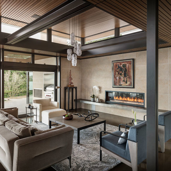
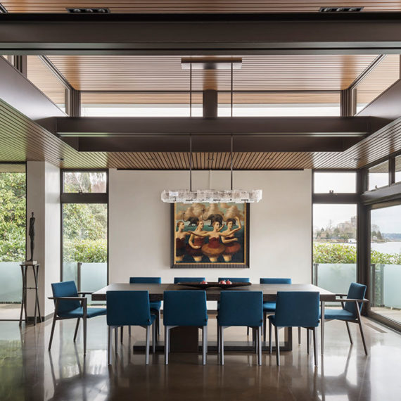
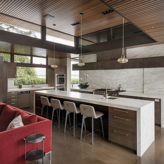
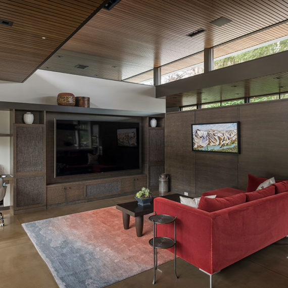
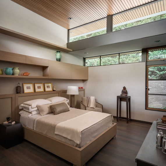
To prevent the home from becoming dark we lifted each roof up on ultra-thin steel posts to allow a continuous band of clerestory windows. Each roof seems to defy gravity as if balanced on pins thereby maximizing the available light. The sun’s direct rays are shielded by the overhanging eves producing a soft even glow while allowing the winter sun to warm the interior. We designed pairs of ultra-thin steel columns to support the roof and the covered walkway and add to the home’s weightless quality, reminiscent of Japanese post and beam structures. One of the aha moments in the designing of the house was the realization that the rooms needed to live under these floating roofs. To accomplish this, we came up with the novel idea to use interior glass panels above the interior walls that allowed visibility through the buildings and enhanced the floating illusion, this detail became another signature of the project.
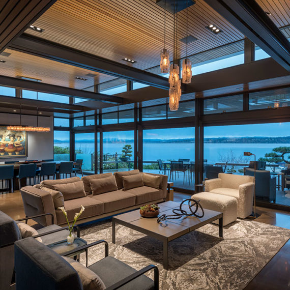
Due to the weather in the Northwest, there are limited outdoor living months. To extend the time one can enjoy the indoor/outdoor living large overhangs were integrated into the design. The exterior terrace was designed with an ultra-thin fourteen-foot-deep cantilevered roof. This dramatic gravity defying cantilever allowed us to eliminate all columns which allowed unobstructed views of the lake and mountains. This was a challenge to achieve from a structural standpoint resulting in much debate between the owner, architect, and structural engineer to get it right. Our client won the day by insisting on the removal of the columns which proved to be one of the best design decisions made and the most important feature for the livability of the house by extending outdoor living from early spring all the way to late fall.
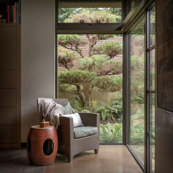
Nothing is more important in designing a courtyard house than to have excellent visibility from within. Floor to ceiling glass was used extensively throughout the home to frame each unique view of the garden as almost a painting. The energy codes were carefully negotiated to make for an efficient thermal dwelling. We designed a ceiling clad with cedar planks for its beauty and for its sound absorption to allow our clients to have large gatherings comfortably. No exposed nails were used in the ceilings. Each plank is separated by a half inch to allow sound to be absorbed into the sound insulation in the cavity above.
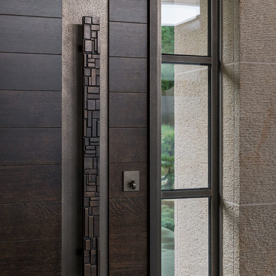
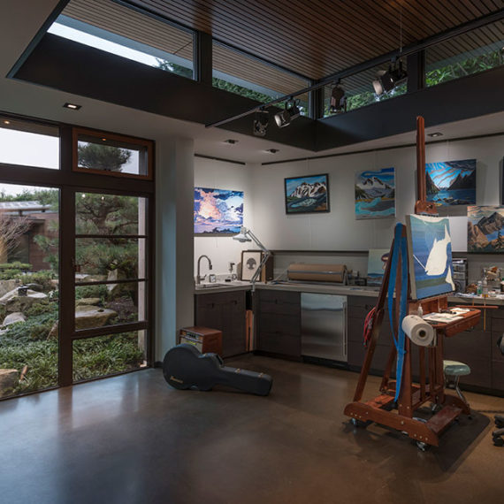
The house is quiet even with lots of people. We created several tactile details including oversized oak doors with a cerused finish and a six-inch wide textured vertical steel panels on the strike side. The main doors use a unique handle that mimics the owners wedding rings. Our client is an avid artist and art collector. His art studio is strategically positioned at the nexus of the two gardens. Like the captain at the bow of the ship he can see both garden courtyards the water course and the rest of the home. The water feature wraps around and embraces this pavilion and, as one of his greatest inspirations, provides inspiration every day.
Hidden Cove Residence was awarded with the Regional 2021 Luxe RED Award for Landscape / Outdoor Room.
Project Team
Architecture: Stuart Silk Architects – Stuart Silk, Design Principal
Interior Furnishings: Sechrist Design – Louanne Low, Project Designer
Landscape Architecture: Land Morphology – Richard Hartlage, Design Principal
Construction: Mercer Builders – Doug Payne, Principal
Photography: Aaron Leitz

